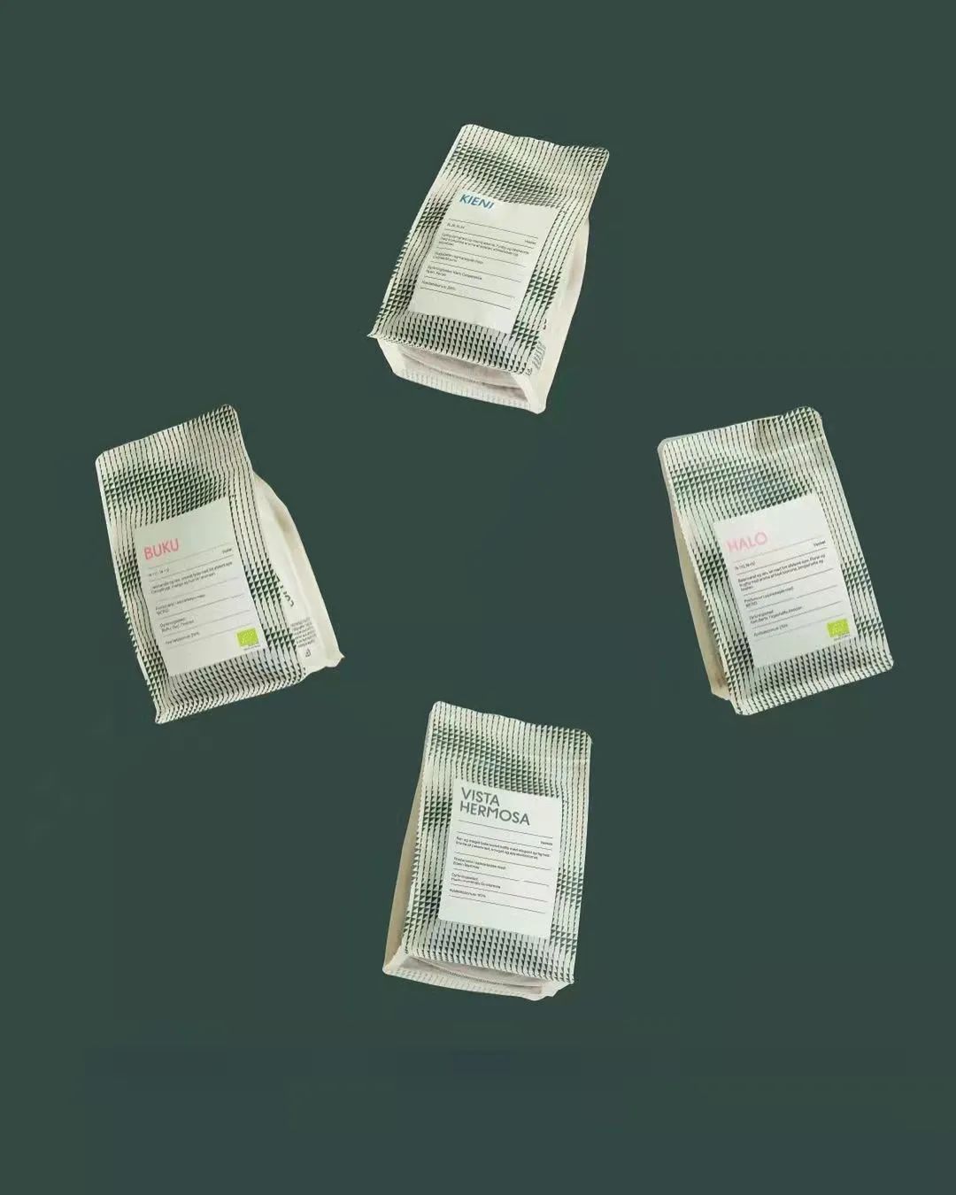
COFFEE PACKAGING
Those interesting coffee packaging
Coffee has become our indispensable friend,
I am used to starting a good day with a cup of coffee every day.
In addition to some interesting coffee shop designs on the street,
There are also some paper coffee cups, take-out handbags,
The packaging design of the coffee beans is also very interesting.
Here are 10 awesome coffee packaging designs,
Let’s take a look!
1.Casino Mocca
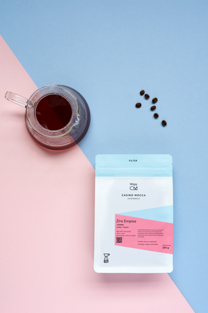
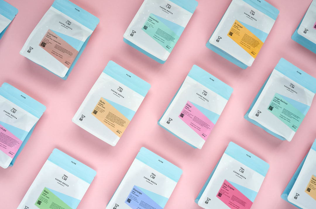
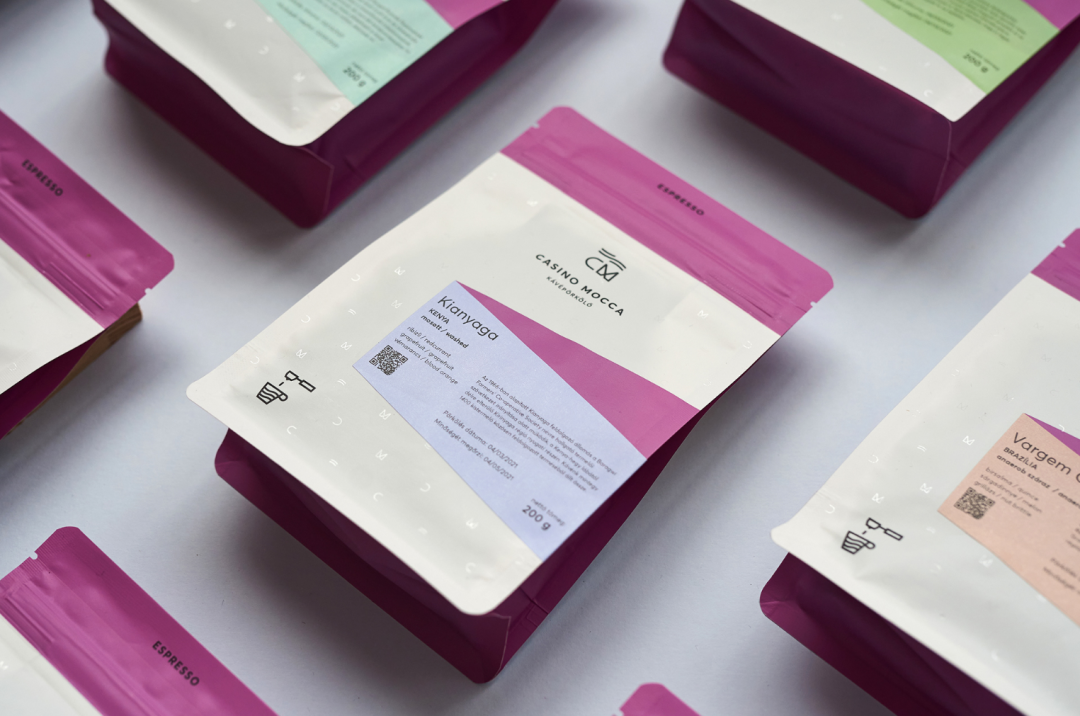
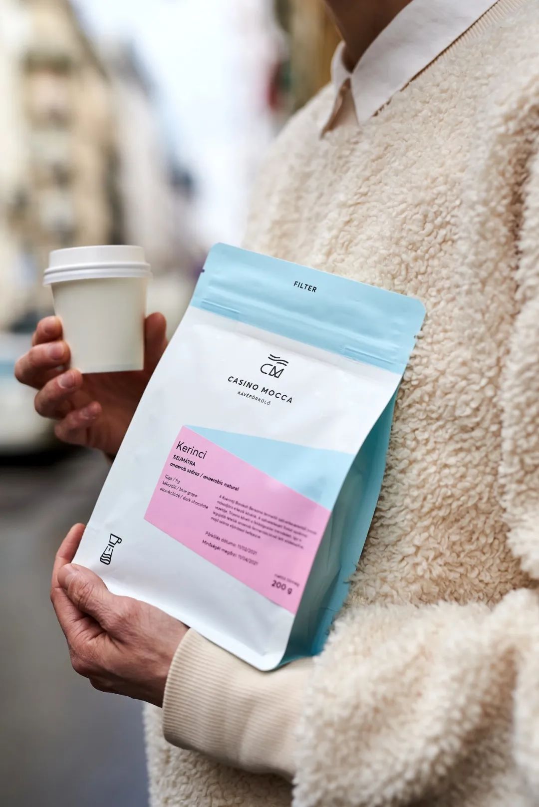
Casino Mocca is a proudly local Hungarian kávépörkölő (coffee roastery), Casino Mocca’s champion barista founders were among the first to bring high quality coffee to Hungary, although they have gained recognition throughout Europe , but they remain true to their roots, sourcing beans from all over the world and working only with small farms.
Fresh and clean is Casino Mocca’s iconic appearance. The clean and simple background coupled with the luster of the matte coffee bag brings a good mood to coffee lovers like a ray of morning sunshine. At the same time, this gentle color scheme also has good practical value. Considering the diversity of products and their classification, Casino Mocca uses different colors to distinguish the type of coffee (for example, blue represents filter coffee, purple represents espresso), and Different flavors and flavors make it easier for customers to choose between products.
2. COFFEE COLLECTIVE
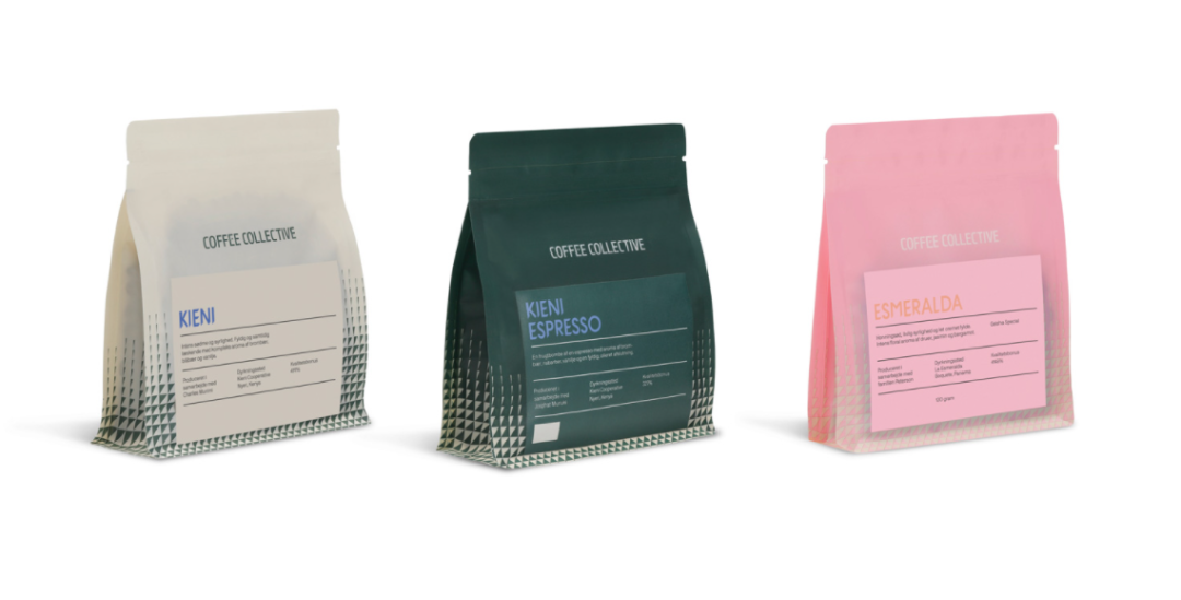
When we buy coffee, we often choose among many exquisite coffee packages, and most of the time we cannot see the product inside – coffee. Coffee Collective thoughtfully solves this problem for us. Coffee Collective in Copenhagen installs a transparent window on the stand-up bag so that consumers can see the roasted coffee. Since light will destroy the flavor of the coffee, the packaging bag uses a transparent bottom so that you can see both the coffee and the coffee. No light enters, ensuring coffee quality.
Text is an important element on Coffee Collective’s packaging. Each letter forms a story about coffee. Here, the farmers on the coffee farms are no longer anonymous, and interesting stories on the farms are made known to us, which also reflects the meaning of “collective” – coffee production is a joint, even collective, effort. What’s interesting is that the Coffee Collective packaging has unique Tasting Notes printed on it, which can provide a reference for people to choose coffee and help them understand, which is of great value to consumers.
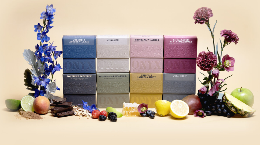
Unlike ordinary coffee packaging bags, ONYX abandons the traditional foil-lined plastic bags and uses colorful boxes with embossed floral patterns to attract people’s attention. The soft solid colors of the box are painted with a soft touch, with embossed top and bottom indentations giving depth to the surface, where light dances with shadows and every angle offers a new window into the beauty of the pressed paper. This also reflects the complexity and ever-changing flavor profiles of coffee – the true intersection of art and science. The combination of such simple yet noble relief art and coffee is really eye-catching and leaves endless aftertaste.
ONYX’s unique packaging is more practical, and since most ONYX coffee is shipped around the world, the box is also highly rigid to prevent breakage and reduce crushing. Moreover, ONYX boxes focus on sustainability. The materials of the boxes can be easily recycled and reused. They can be used to hold other coffees and to store daily necessities.
4.Brandywine
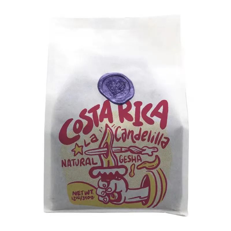
If you are accustomed to neat and square printing fonts, or think that life is so ordinary and routine, then Brandywine will definitely make your eyes shine. This roaster from Delaware in the United States consists of a small team of no more than 10 people. Local artist Todd Purse draws unique packaging illustrations for each of the beans produced, and no one is repeated.
Among the many well-designed coffee packages, Brandywine appears to be particularly alternative, uninhibited, exquisite, cute, fresh, warm and kind. The iconic wax seal makes this bag of coffee beans look more like a sincere letter from the roaster, and also gives people a hint of retro charm. Brandywine also does a lot of customized content. They draw unique packaging for agency partners (you can find coffee bean bags with the boss’s name “gui” printed on them at Coffee365), draw commemorative packaging for Betty White’s 100th birthday, and even create special packaging for Valentine’s Day. Accept 30 customer customizations before the holiday.
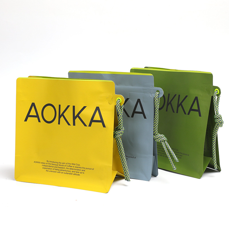
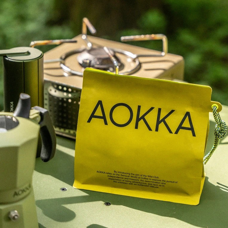
COFFEE FOR RAWMANCE – Born in the wilderness, the free and romantic design concept is the visual language of AOKKA that supports the entire brand. Romance does not have to be sweet, delicate, perfect, or controllable. It can also be natural, rough, primitive, and free. We were born in the wilderness, but we are free and romantic. Coffee crops grow in the wilderness around the world. They are cultivated, picked, and processed into green coffee beans. Each package of green coffee beans reaches the destination through logistics and transportation, and has AOKKA’s transportation label and unique sealing rope. It has become The visual language of AOKKA.
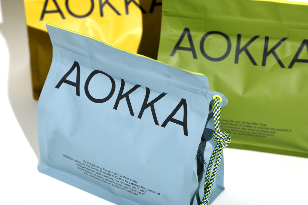
Green and fluorescent yellow are the main colors of AOKKA’s brand. Green is the color of the wilderness. The fluorescent yellow color is inspired by the logos of outdoor products and transportation safety. Yellow and blue are AOKKA’s auxiliary brand colors, and AOKKA’s color system is also used to distinguish product lines, such as Curiosity series (yellow), Discovery series (blue) and Adventure series (green). Likewise, the unique closing cord subtly embodies sport and adventure.
The brand spirit of AOKKA is independence and freedom, as well as the determination and expectation to go out and take risks. Sharing different opinions and stories, facing the unknown with an unconventional attitude, and experiencing romantic freedom with wild intentions, AOKKA brings customers a rich experience and allows everyone to enter the rich vision of coffee.
Post time: Jan-20-2024

